Trend Indicators
Introduction
Trend indicators are essential tools in technical analysis that help traders and investors identify the direction and strength of a market trend. They provide insights into whether a market is moving upward, downward, or sideways, and can be vital in decision-making processes for buying, selling, or holding assets.
Purpose of Trend Indicators
- Identifying Trend Direction: Trend indicators help in determining whether the market is in an uptrend, downtrend, or moving sideways.
- Strength of Trend: They gauge the momentum and strength of a trend, helping traders understand how strong or weak a particular trend is.
- Potential Reversals: By recognizing overbought or oversold conditions, trend indicators can signal potential reversals.
- Entry and Exit Points: They assist in finding optimal entry and exit points for trades, maximizing profit potential.
Application in Different Market Conditions
- Uptrend: Trend indicators can help identify the beginning of an uptrend, providing opportunities to buy or go long.
- Downtrend: They can signal the start of a downtrend, indicating potential selling or shorting opportunities.
- Sideways Market: In a market without a clear trend, trend indicators may help in recognizing range-bound conditions suitable for specific trading strategies.
Limitations and Challenges
- Lagging Nature: Some trend indicators, especially moving averages, may lag behind the actual market movement.
- False Signals: They can sometimes provide false signals, leading to potential losses.
- Complexity: Understanding and interpreting multiple trend indicators simultaneously can be complex, especially for beginners.
Trend indicators we’ll discuss include moving averages, Parabolic SAR, SuperTrend, and Ichimoku Kinkō Hyō.
Our Best Chosen Trend Indicator
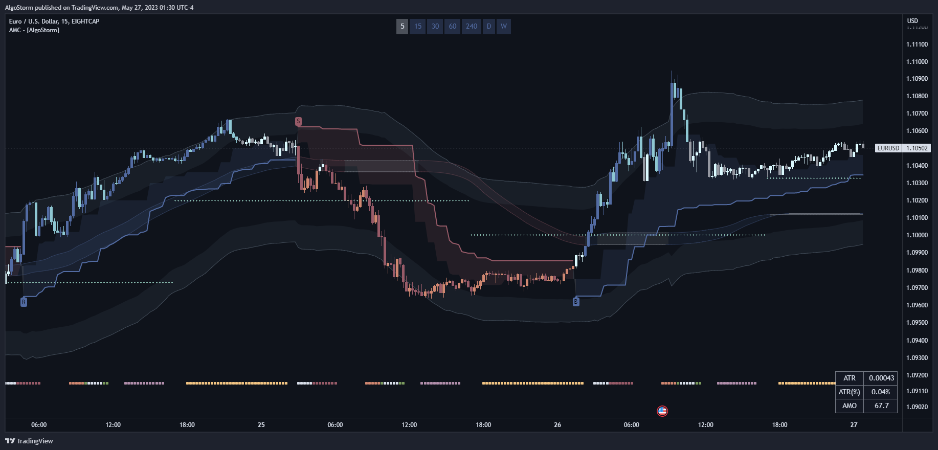
AlgoStorm Market Compass (AMC)
This is one of our own premium indicators. You can access it by joining our membership at AlgoStorm.com
Main Features:
- Complete trading system with everything you need!
- It takes trend, momentum, volatility, and volume into account.
- It displays a base channel for identifying the trend more clearly and accurately.
- It displays potential dynamic supply and demand zones.
- It optionally colors the candles according to an innovative proprietary algorithm that accurately detects the trend.
- It displays the Central Pivot Range (CPR).
- It displays the IDR/DR boxes.
- It displays the key trading zones in every session.
- It displays two custom moving averages of any type you wish (SMA, EMA, SMMA, VWMA, HMA, LSMA, ZLSMA, VIDYA, T3).
- It displays a trend panel that shows the overall trend on all timeframes.
- It displays a technical panel that measures the ATR and the volume-based momentum.
- It helps you in eliminating the noise while making proper decisions.
- It is the perfect companion for the AlgoStorm Institutional Trading Concepts (A-ITC) strategies.
- It is a perfect companion for the ICT/SMC trading strategies.
- It is highly customizable and works on all timeframes.
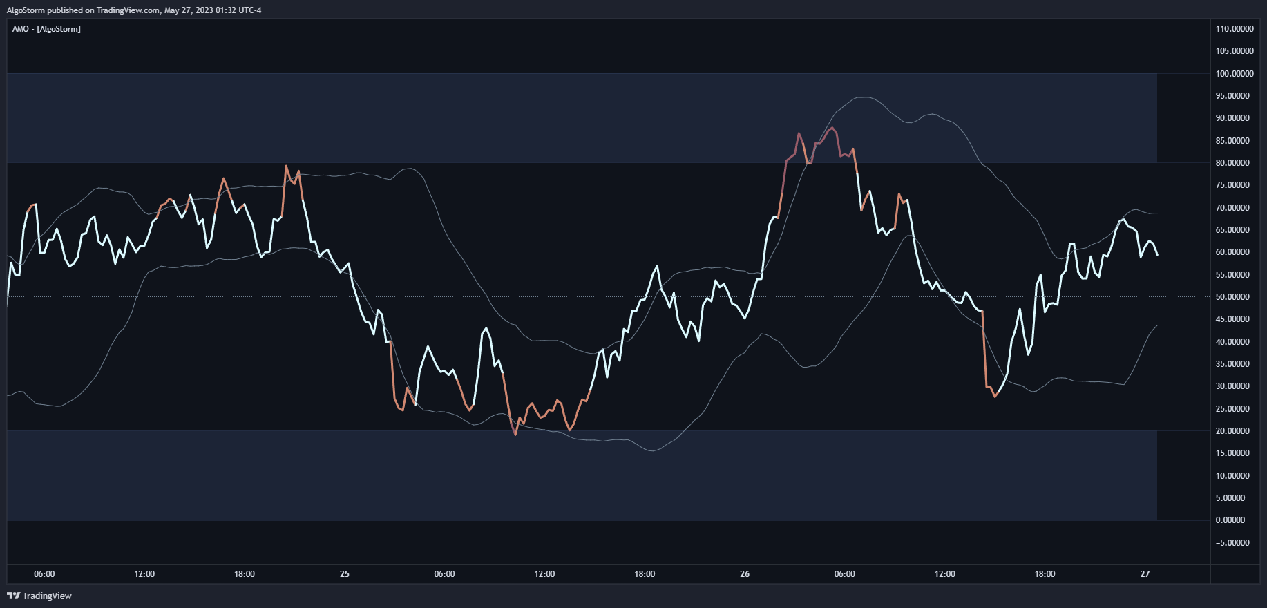
AlgoStorm Momentum Oscillator (AMO)
This is one of our own premium indicators. You can access it by joining our membership at AlgoStorm.com
Main Features:
- Innovative trend & momentum oscillator.
- Provides insights into the weakness or strength of the market.
- It affirm trends and can anticipate possible reversals.
- Perfect for spotting regular and hidden divergences.
- It is much more accurate than other momentum indicators since it factors price, momentum, volatility, and volume.
- It is highly customizable and works on all time-frames.
- In our trading academy, we teach the right way to use this indicator.
Note: In case you like to trade with free trend-based indicators, this guide will cover the most notable ones.
Moving Averages
Moving averages are a fundamental tool in technical analysis, helping traders and investors to identify trends and make predictions about future price movements. They are used to smooth out price data over a specific period to eliminate noise and better understand the underlying trend. In this guide, we’ll explore different types of moving averages, including Simple Moving Average (SMA), Exponential Moving Average (EMA), Smoothed Moving Average (SMMA), Volume Weighted Moving Average (VWMA), Hull Moving Average (HMA), Arnaud Legoux Moving Average (ALMA), Least Squares Moving Average (LSMA), Guppy Multiple Moving Average (GMMA), and Kaufman’s Adaptive Moving Average (KAMA).
Simple Moving Average (SMA)
Definition
The Simple Moving Average (SMA) is the arithmetic mean of a given set of prices over a specific number of periods.
Calculation
- Select the period (e.g., 10 days).
- Add the closing prices for those periods.
- Divide the sum by the number of periods.
Usage
SMA is often used to identify trends by smoothing out short-term fluctuations.
Opinion
SMA is straightforward and widely used but can be slow to respond to recent price changes.
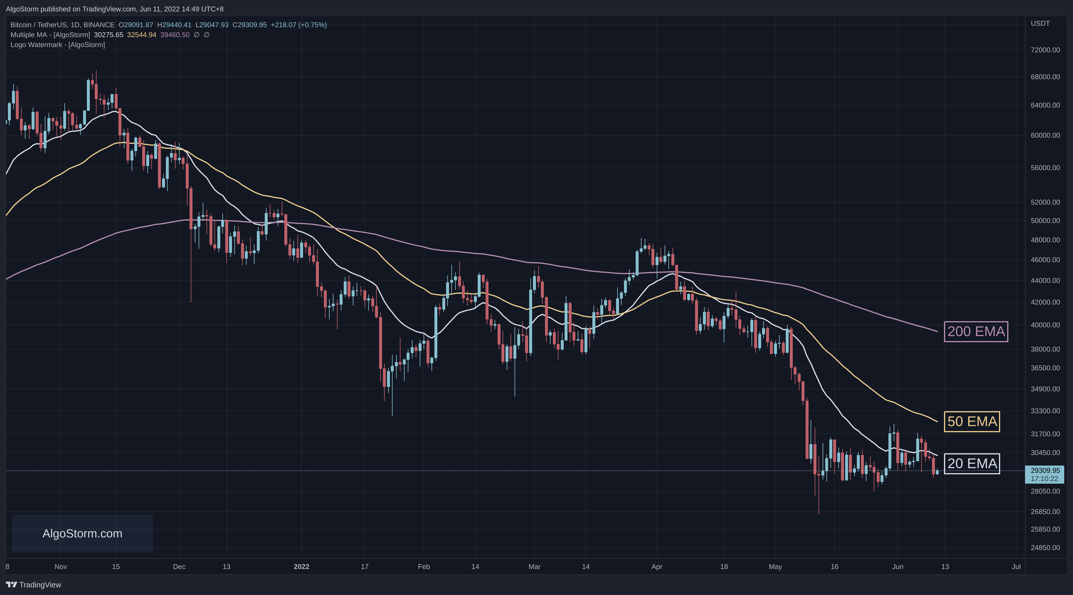
Exponential Moving Average (EMA)
Definition
EMA gives more weight to recent prices, making it more responsive to new information.
Calculation
- Choose a period (e.g., 10 days).
- Calculate the SMA for the first period.
- Calculate the multiplier: ( \frac{2}{\text{period} + 1} ).
- Calculate EMA:
\text{EMA} = (\text{Close} - \text{Previous EMA}) \times \text{multiplier} + \text{Previous EMA}Usage
EMA is used to identify trends and reversals more quickly than SMA.
Opinion
EMA is more complex but provides a more accurate reflection of recent price movements.
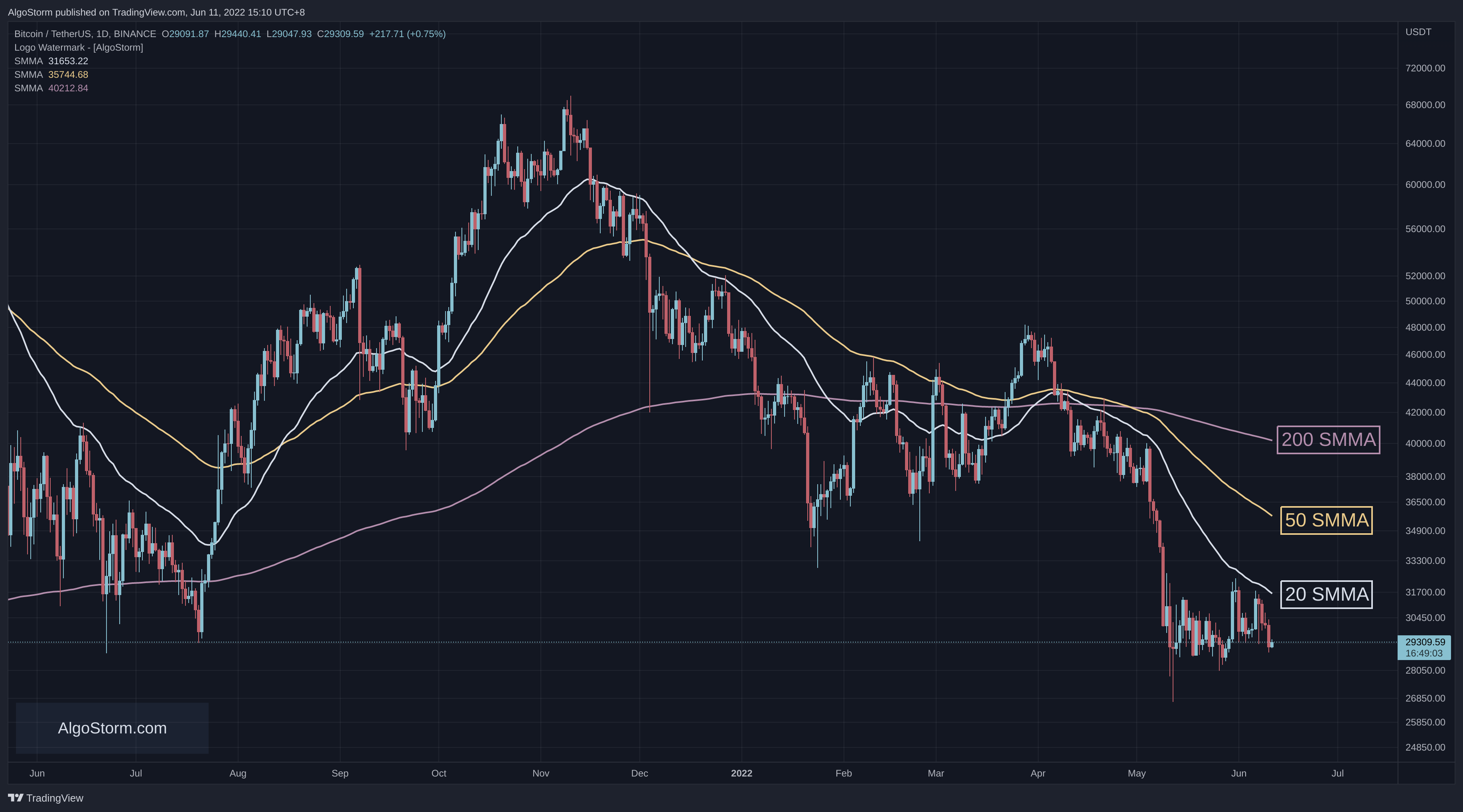
Smoothed Moving Average (SMMA)
Definition
SMMA is a blend of SMA and EMA, providing a smoother line that reacts more moderately to price changes.
Calculation
- Choose a period.
- Calculate the first SMA.
- For subsequent periods, use:
\text{SMMA} = \frac{\text{Previous SMMA} \times (n - 1) + \text{Close}}{n}Usage
SMMA is used when a smoother trend line without much lag is desired.
Opinion
SMMA is a balanced choice, providing a compromise between responsiveness and smoothness.
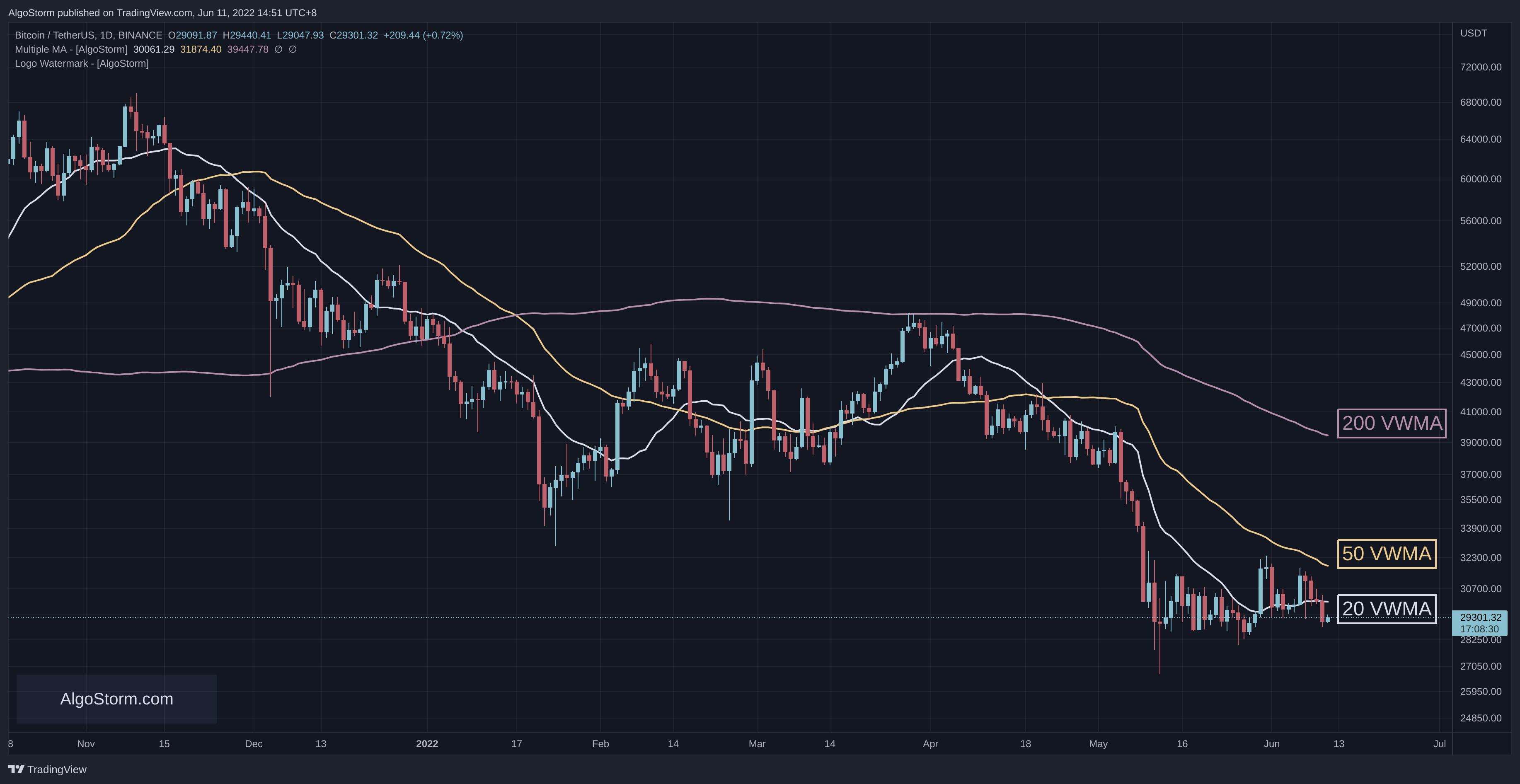
Volume Weighted Moving Average (VWMA)
Definition
VWMA considers both price and trading volume, giving more weight to periods with higher volume.
Calculation
- Multiply each closing price by its volume.
- Sum these products.
- Divide by the total volume for the period.
Usage
VWMA is used to confirm trends by considering volume, reflecting the intensity of trading activity.
Opinion
VWMA provides a more nuanced view but may be more challenging to interpret.
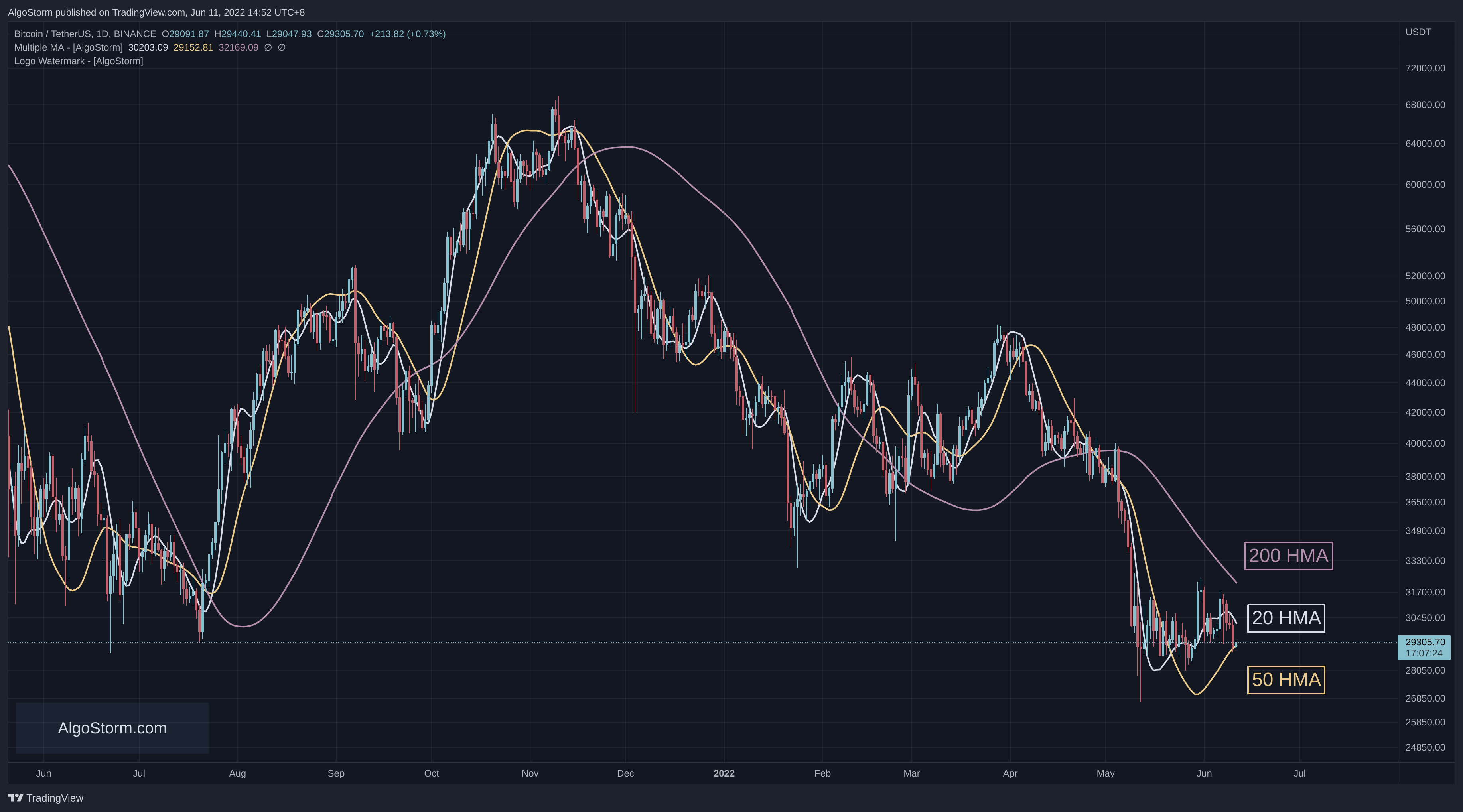
Hull Moving Average (HMA)
Definition
HMA is designed to reduce lag and improve smoothness.
Calculation
- Calculate WMA for two different periods (e.g., 10 and 20).
- Subtract the longer WMA from twice the shorter WMA.
- Calculate the square root of the period for the final WMA.
Usage
HMA is used when minimal lag and smoothness are required.
Opinion
HMA is innovative but can be more complex to calculate and interpret.
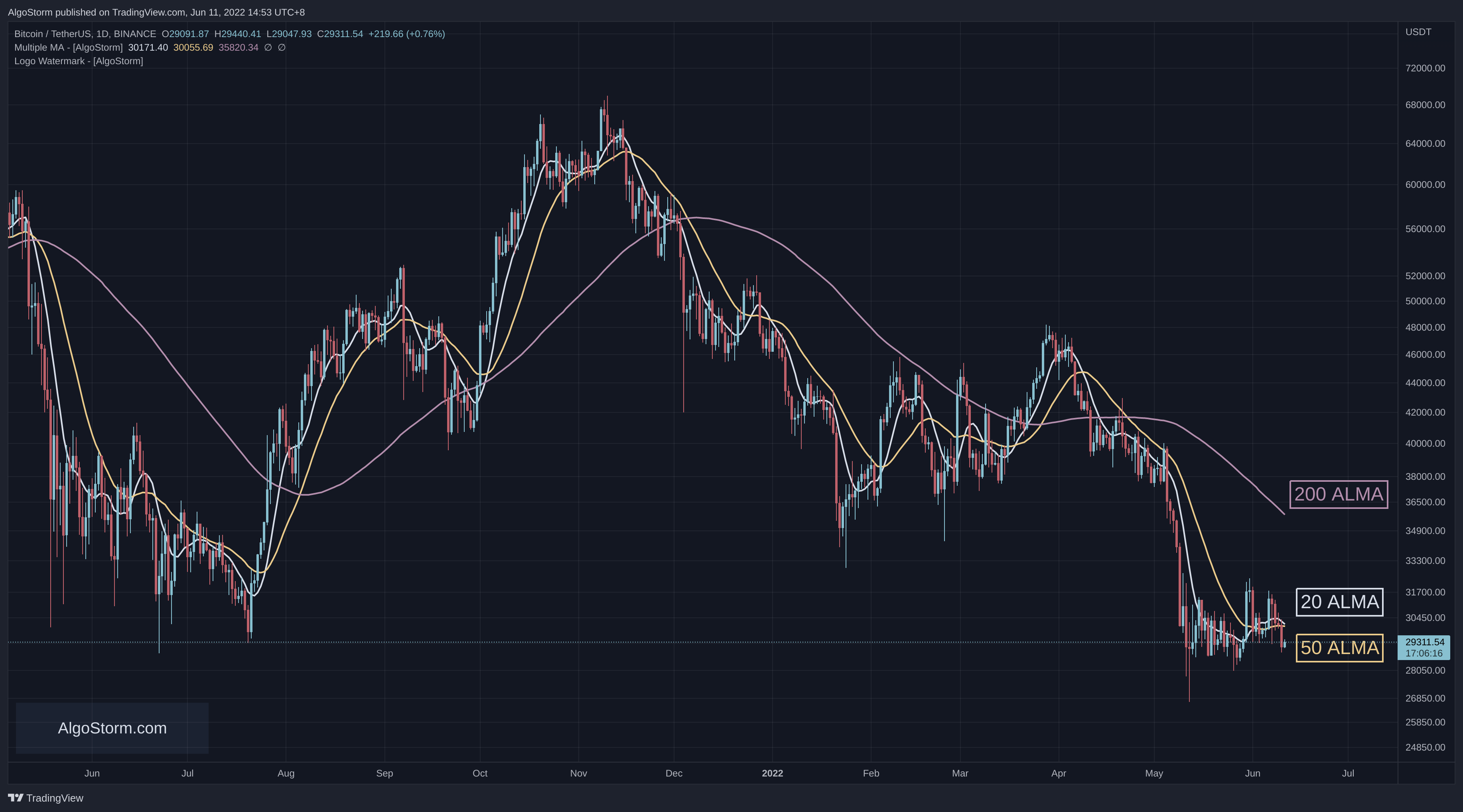
Arnaud Legoux Moving Average (ALMA)
Definition
ALMA reduces noise and lag, using a Gaussian distribution to weigh prices.
Calculation
- Choose a period and other parameters.
- Apply a Gaussian function to weigh the prices.
- Sum the weighted prices and divide by the sum of the weights.
Usage
ALMA is used when a highly responsive yet smooth trend line is desired.
Opinion
ALMA is advanced and effective but may be too complex for beginners.
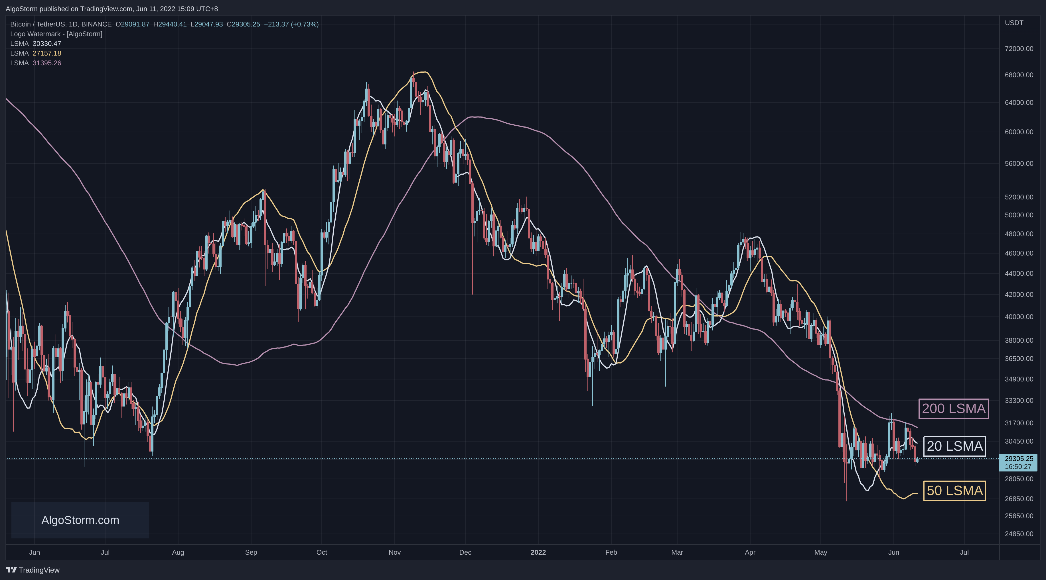
Least Squares Moving Average (LSMA)
Definition
LSMA applies linear regression to find the best-fitting line through the price data.
Calculation
- Choose a period.
- Apply linear regression to the closing prices.
Usage
LSMA is used to identify trends by fitting a straight line to the data.
Opinion
LSMA provides a unique perspective but assumes a linear relationship, which may not always hold.
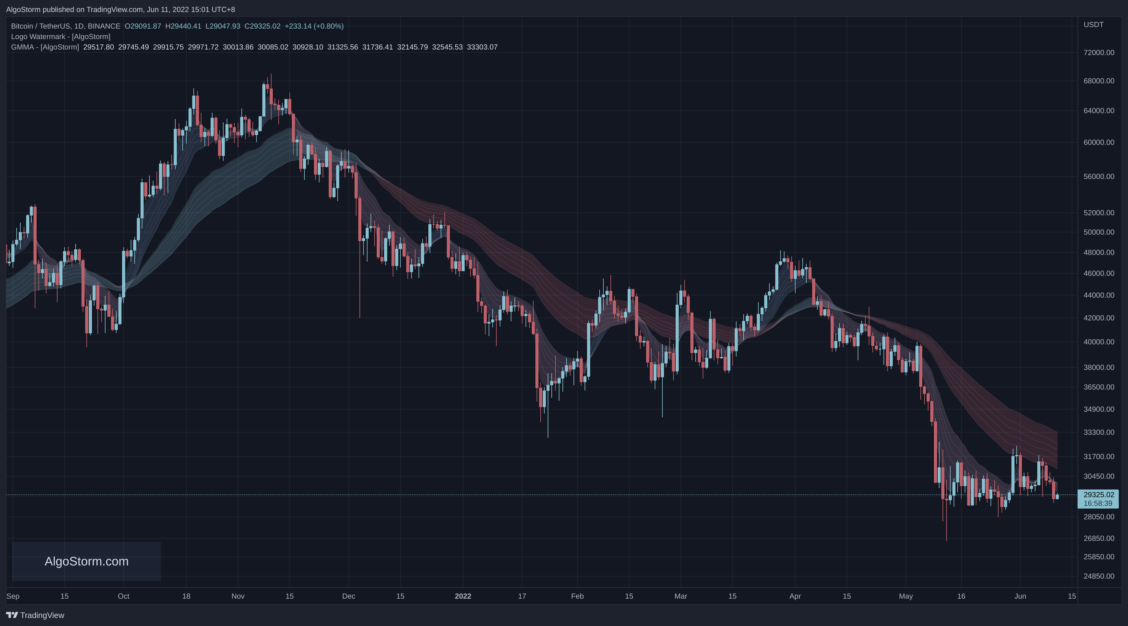
Guppy Multiple Moving Average (GMMA)
Definition
GMMA uses multiple EMAs to understand both short-term and long-term trends.
Calculation
- Calculate several short-term and long-term EMAs.
- Plot them together to understand the relationship between different trends.
Usage
GMMA is used to understand the interaction between short-term traders and long-term investors.
Opinion
GMMA provides a rich, multifaceted view but requires careful interpretation.
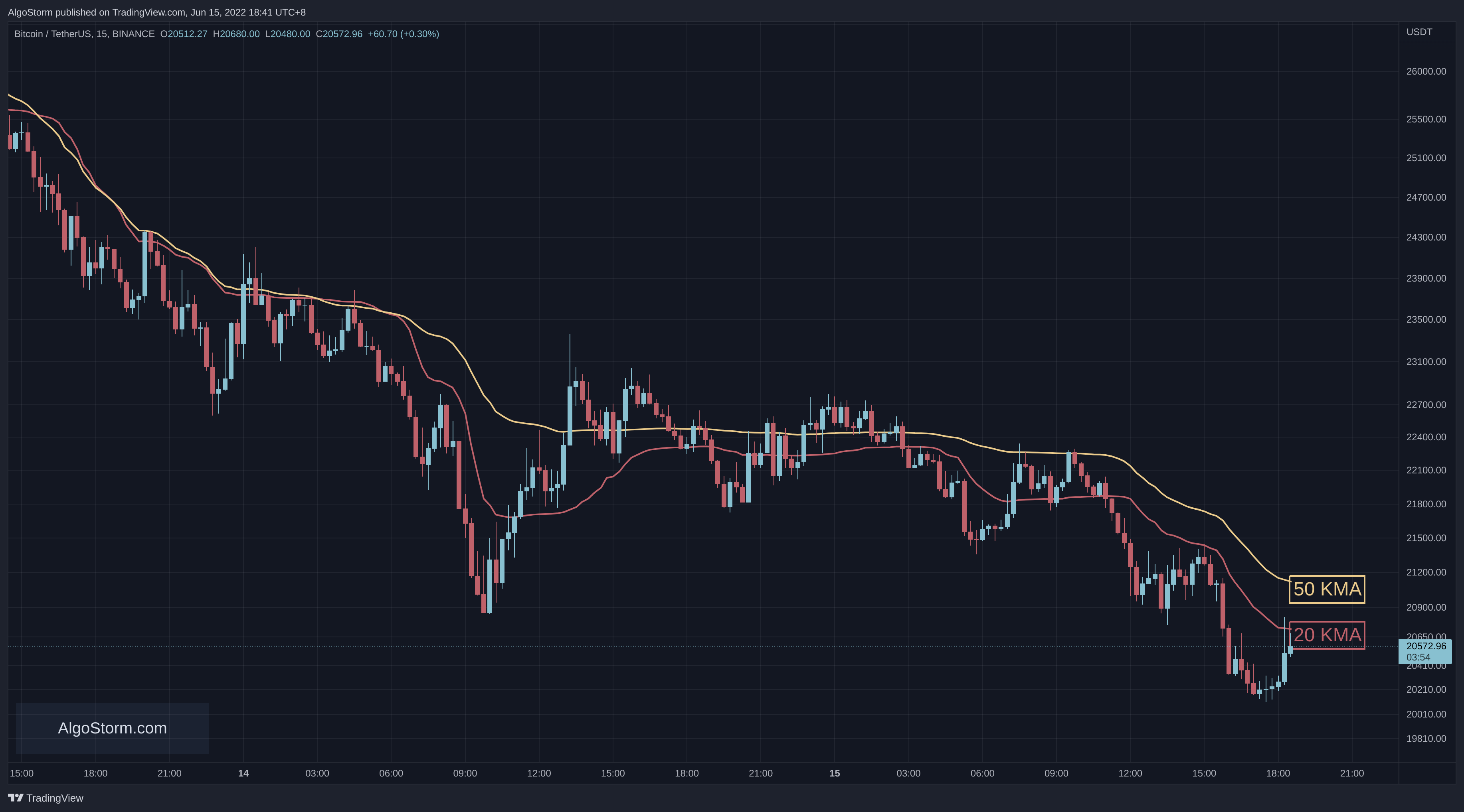
Kaufman’s Adaptive Moving Average (KAMA)
Definition
KAMA adjusts its sensitivity based on market volatility.
Calculation
- Calculate the Efficiency Ratio (ER).
- Calculate the Smoothing Constant (SC):
\text{SC} = \left( \frac{ER \times (2 / (2 + 1) - 2 / (30 + 1)) + 2 / (30 + 1)}{2} \right)^2- Calculate KAMA:
\text{KAMA} = \text{Previous KAMA} + \text{SC} \times (\text{Close} - \text{Previous KAMA})Usage
KAMA is used when an adaptive approach that responds to market volatility is required.
Opinion
KAMA is highly adaptive and useful in various market conditions but requires a deeper understanding of market dynamics.
Popular Moving Averages
- The most popular type of moving averages are: SMA and EMA
- The most popular periods for moving averages are: 20, 50, and 200
Note 1: Some traders use Fibonacci periods: 8, 21, 34, 55, 89. 144, 233.
Note 2: Some traders also use the MACD periods: 12, 26.
Parabolic Stop & Reverse (PSAR or SAR)
Introduction to PSAR
The Parabolic Stop & Reverse (PSAR) is a popular technical indicator developed by J. Wells Wilder. It’s a tool used by traders to determine the direction of a trend and identify potential reversals in asset prices. The PSAR is also known as the parabolic stop and reverse, parabolic SAR, or simply PSAR.
PSAR Overview
Visual Representation
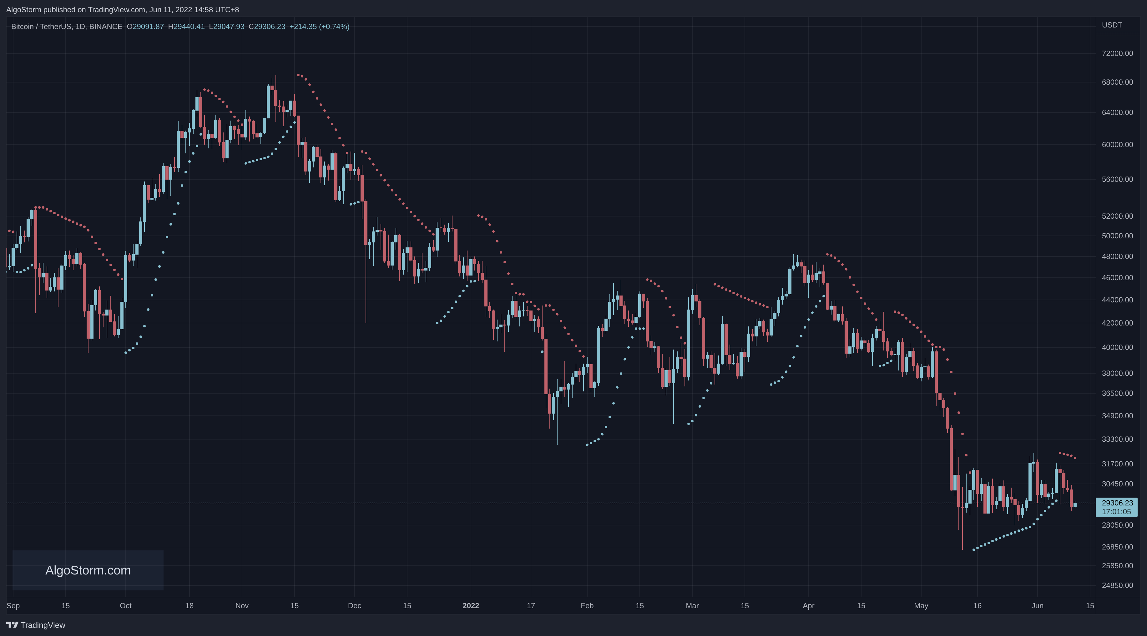
The PSAR appears on a chart as a series of dots, either above or below an asset’s price, depending on the direction the price is moving. When the price is trending upward, a dot is placed below the price. Conversely, when the price is trending downward, a dot is placed above the price.
A reversal in the PSAR occurs when these dots flip positions. However, it’s crucial to understand that a reversal signal in the PSAR does not necessarily mean a reversal in the price itself. A PSAR reversal only signifies that the price and indicator have crossed paths.
Using PSAR
Buy and Sell Signals
The parabolic indicator generates buy or sell signals when the position of the dots moves from one side of the asset’s price to the other. Specifically:
- Buy Signal: Occurs when the dots move from above the price to below the price.
- Sell Signal: Occurs when the dots move from below the price to above the price.
Trailing Stop Loss Orders
Traders often use the PSAR dots to set trailing stop loss orders. For instance, if the price is rising and the PSAR is also ascending, the PSAR can be used as a possible exit point for a long position. If the price drops below the PSAR, it may be time to exit the long trade.
PSAR Movement
The PSAR moves regardless of whether the price moves. Even if the price initially rises but then moves sideways, the PSAR will continue to rise. A reversal signal will eventually be generated, even if the price hasn’t dropped. The PSAR only needs to catch up to the price to generate a reversal signal. This characteristic means that a reversal signal on the indicator doesn’t necessarily indicate a price reversal.
Market Conditions
The PSAR is most effective in trending markets where large price moves allow traders to capture significant gains. In range-bound markets, where a security’s price is not making significant moves, the indicator will constantly reverse, leading to multiple low-profit or losing trades.
Combining with Other Indicators
For optimal results, traders should use the parabolic indicator in conjunction with other technical indicators that can determine whether a market is trending.
The Parabolic SAR vs. Moving Average (MA)
While both PSAR and MAs track price and help show the trend, they do so using different methodologies.
- Moving Average (MA): Takes the average price over a selected number of periods and plots it on the chart.
- PSAR: Looks at extreme highs and lows and then applies an acceleration factor.
These varying formulas result in different visual representations on the chart and provide distinct analytical insights and trade signals.
Limitations of Using the Parabolic SAR Indicator
Constant Signals
The PSAR is always active, constantly generating signals. This can lead to many signals being of poor quality, especially when no significant trend is present or develops following a signal.
Reversal Signals
Reversal signals are generated eventually, regardless of whether the price actually reverses. This is due to the acceleration factor in the formula, which means a reversal signal may prompt a trader to exit a trade even though the price hasn’t technically reversed.
Conclusion
The Parabolic Stop & Reverse (PSAR) is a valuable tool for identifying trends and potential reversals. Its unique visual representation and ability to generate buy and sell signals make it appealing to active traders. However, understanding its limitations and combining it with other technical indicators can enhance its effectiveness.
In trending markets, the PSAR can be a powerful ally, but in range-bound conditions, it may lead to false signals. Therefore, a comprehensive understanding of market conditions and a strategic application of the PSAR can lead to more informed trading decisions.
SuperTrend (ST) Indicator
Introduction to SuperTrend
The SuperTrend indicator, created by Olivier Seban, is a versatile tool designed to work across various time frames and assets. It’s a trend-following or lagging indicator that provides insights into market trends and potential reversals.
SuperTrend Overview
Visual Representation
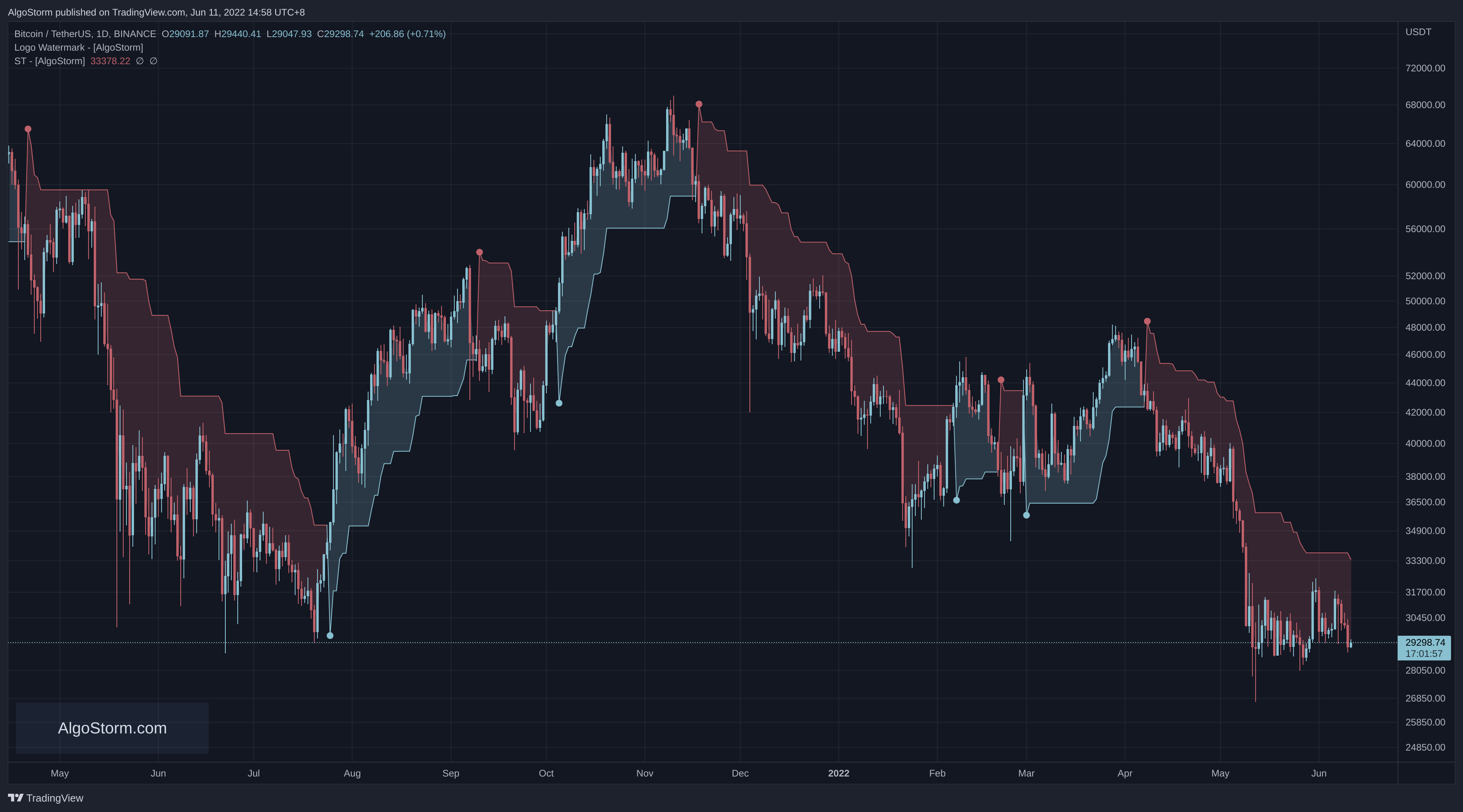
SuperTrend is an overlay built into technical analysis charting platforms, changing color based on the detected trend. It’s particularly useful in trending markets but may produce inaccurate signals when the market is range-bound.
For instance, if a cryptocurrency’s closing price is above the line, the indicator turns green, signaling a buy opportunity. Conversely, if the closing price falls below the line, the SuperTrend indicator turns red, indicating a sell signal.
The SuperTrend indicator relies on two essential parameters: the Average True Range (ATR) period and the multiplier. The ATR reflects the asset’s overall price range, providing insights into its volatility and trading range.
Characteristics of the SuperTrend Indicator
Color-Coded Signals
The SuperTrend indicator is characterized by red and green lines:
- Green Line: Represents a buy signal and indicates bullish market sentiment.
- Red Line: Represents a sell signal and signifies bearish market sentiment.
Crossover Points
The point where the indicator line changes color is referred to as the crossover point. This point helps traders gauge the market’s bullishness or bearishness and identify support and resistance zones. These zones can be instrumental in determining stop-loss levels.
Performance in Different Market Conditions
While the SuperTrend indicator excels in trending markets, it may generate false signals during sideways market movements. This characteristic emphasizes the importance of using the SuperTrend in conjunction with other indicators to confirm trends.
SuperTrend Calculation
Calculating the SuperTrend requires two inputs: the period (number of days for the ATR) and the multiplier.
Formula
The formula for calculating the SuperTrend varies for uptrends and downtrends:
- Uptrends (shown in green):
\frac{{\text{{High Price}} + \text{{Low Price}}}}{2} - (\text{{multiplier}} \times \text{{ATR}})- Downtrends (shown in red):
\frac{{\text{{High Price}} + \text{{Low Price}}}}{2} + (\text{{multiplier}} \times \text{{ATR}})Default Settings
Typically, the SuperTrend indicator comes with a default setting of ATR 10 and a multiplier of 3. However, these parameters may need adjustments for different assets and trading styles.
Adjusting Parameters
Lowering the parameters of the SuperTrend indicator can increase the number of buy and sell signals, providing faster insights. However, this also raises the risk of false signals or whipsaws. Therefore, confirming trends with other indicators becomes crucial when adjusting these parameters.
Conclusion
The SuperTrend indicator is a valuable tool for traders seeking to identify trends and potential reversals across various assets and time frames. Its color-coded signals and adaptability make it user-friendly, but understanding its limitations and optimal settings is essential for effective utilization.
While the SuperTrend performs well in trending markets, it may require complementary indicators to confirm signals in range-bound conditions. Experimenting with different parameters and combining the SuperTrend with other technical analysis tools can lead to a more nuanced and successful trading strategy.
Ichimoku Kinkō Hyō
Introduction to Ichimoku Kinkō Hyō
The Ichimoku Kinko Hyo, commonly referred to as Ichimoku, is a multifaceted technical indicator used to gauge momentum, support, and resistance. Originating from Japan, it’s an all-in-one tool that provides a comprehensive view of the market. The name "Ichimoku" translates to "one look" in Japanese, reflecting the indicator’s ability to provide a complete market overview at a glance.
Ichimoku Kinkō Hyō Overview
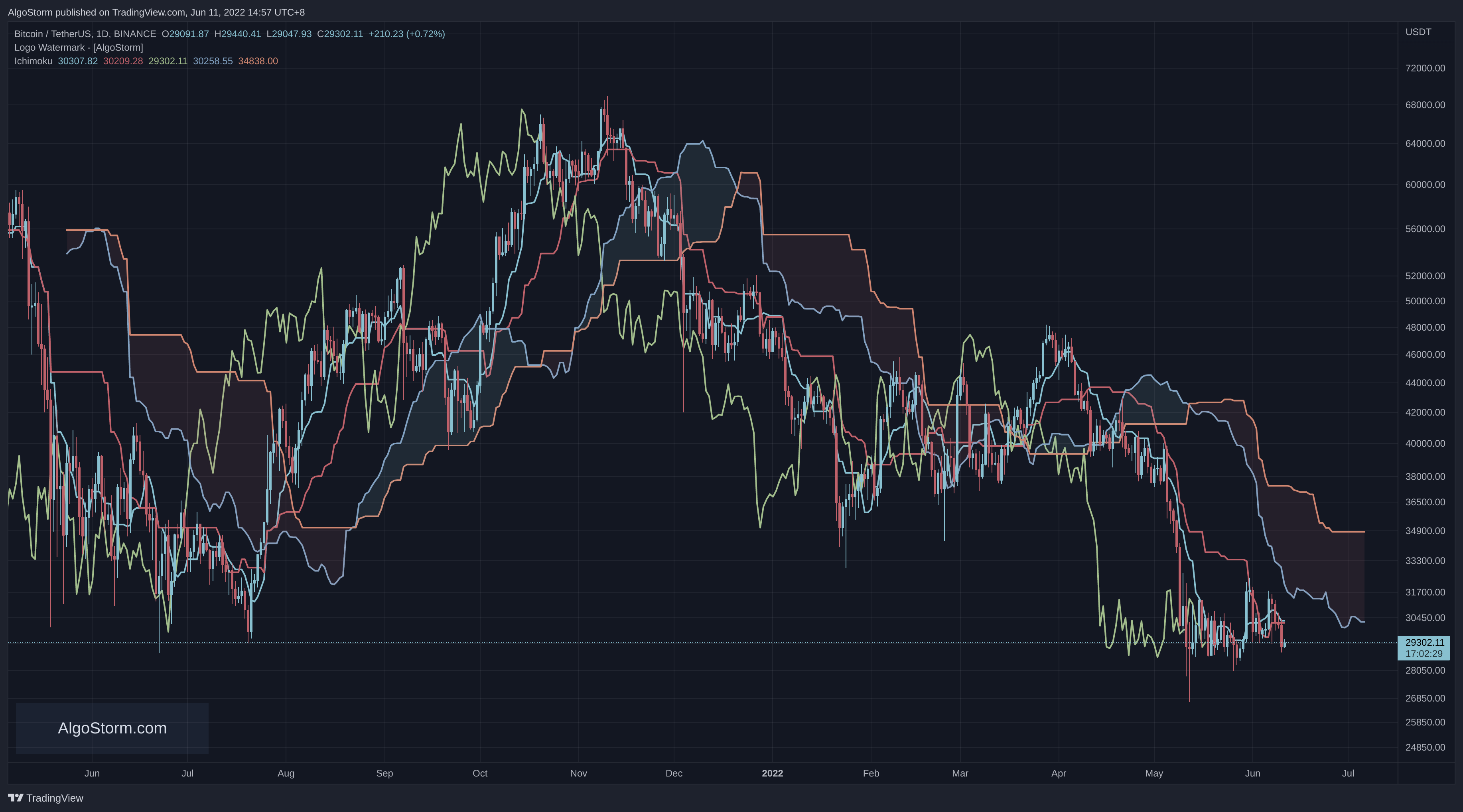
Ichimoku Kinkō Hyō Illustration:
Historical Background
Developed by a Japanese newspaper writer, the Ichimoku Kinko Hyo was designed to consolidate various technical strategies into a single, easily interpretable indicator. Though it may appear complex to novice traders, understanding the various lines and their functions quickly demystifies the indicator.
Integration with Other Technical Analysis
Despite its goal of being an all-in-one indicator, the Ichimoku is often used in conjunction with other forms of technical analysis to provide a more nuanced view of the market.
Components of the Ichimoku Kinkō Hyō
The Ichimoku indicator consists of five key lines:
Tenkan-sen (Conversion Line): Represents a key support and resistance level and a signal line for reversals. Calculated as the average of the highest high and lowest low over the past nine periods.
Kijun-sen (Base Line): Another key support and resistance level, used for confirming trend changes and as a trailing stop-loss point. Calculated as the average of the highest high and lowest low over the past 26 periods.
Senkou Span A (Leading Span A): Forms one edge of the kumo (cloud) and identifies future support and resistance areas. Calculated by averaging the tenkan-sen and kijun-sen and plotting the result 26 periods ahead.
Senkou Span B (Leading Span B): Forms the other edge of the kumo and is used similarly to Senkou Span A. Calculated by averaging the highest high and lowest low over the past 52 periods and plotting the result 26 periods ahead.
Chikou Span (Lagging Span): Shows possible areas of support and resistance by plotting the current period’s closing price 26 days back on the chart.
Interpreting the Ichimoku Kinkō Hyō
Trend Analysis
- Uptrend: Price is above the cloud, and Leading Span A is above Leading Span B (typically colored green).
- Downtrend: Price is below the cloud, and Leading Span A is below Leading Span B (typically colored red).
- Transitioning or Trendless: Price is within the cloud.
Support and Resistance
The cloud provides dynamic support and resistance levels that can be projected into the future, setting the Ichimoku Cloud apart from many other technical indicators.
Crossovers
Crossovers between the conversion line and the base line can be powerful buy or sell signals, depending on their relative positions and the location of the price concerning the cloud.
Using the Ichimoku Kinkō Hyō
Combining with Other Indicators
Traders often pair the Ichimoku Cloud with other indicators like the Relative Strength Index (RSI) to confirm momentum in a particular direction. Understanding broader trends and how smaller trends fit within them is also crucial.
Customization
Most charting software allows hiding certain lines to reduce visual clutter. Traders can focus on the lines that provide the most valuable information for their specific strategy.
Limitations of the Ichimoku Kinkō Hyō
Visual Complexity: With multiple lines, the chart can look busy, potentially distracting traders.
Historical Data Basis: Although two data points are plotted in the future, the formula is not inherently predictive, as it relies on historical averages.
Irrelevance During Strong Trends: The cloud may become irrelevant if the price remains significantly above or below it for extended periods.
Conclusion
The Ichimoku Kinko Hyo is a versatile and comprehensive technical indicator that offers valuable insights into market trends, momentum, and potential support and resistance levels. While it aims to be an all-in-one tool, its effectiveness can be enhanced when used in conjunction with other technical analysis methods.
Understanding the components and interpretation of the Ichimoku can empower traders to make more informed decisions. Whether used alone or as part of a broader analytical toolkit, the Ichimoku Kinko Hyo remains a valuable asset for traders seeking a multifaceted view of the market.
